Showing posts with label logos. Show all posts

Monday, February 23, 2009

Hail to the Citizens of Tropicana

Amid all the gloomy news, one ray of brightness: Tropicana undoes its mistake.


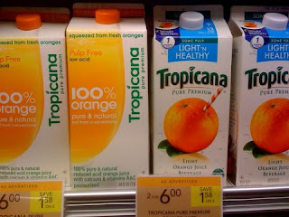
(Which would you rather buy?)

I detested the new generic packaging and stingy logo on the left. A supermarket should be a place of visual delight. The true Tropicana orange leads me to an aisle of abundance where the Land O'Lakes lady kneels next to pink and brown egg cartons, white milk and yellow cheese.

This new watered-down look could only be described as perverse. Also infuriating to search for the variety, so clearly labelled on the neck before.

Not surprising: the backlash chronicled today, as people clamored for a return to the original. Surprising: PepsiCo gave in to their demands.

A brand's true owner may not be its trademark holder, after all.

Wednesday, February 18, 2009

Is a smile the new swoosh?

Have things gotten so bad we need laughing logos? If two make a trend, then yesterday's unveiling of Kraft's new corporate mark, plus Pepsi's maybe-Obama-inspired new "series of smiles" must mean something.


Of course Amazon has worn a smile for years.
We may not mourn the swoosh as a design cliche--too achievement-oriented for the Millennials?--but maybe we should dread what it's turning into.

Tuesday, February 3, 2009

What football team did FDR name?

The football season is over, but it's never too late for a quirky question:
Which team was named after a potent symbol of the New Deal?


Answer: In 1933 the NFL franchise known as the Frankford Yellowjackets was sold for $2500 and rechristened the Philadelphia Eagles in honor of the National Recovery Administration logo.


Let's hope President Obama can generate such popular enthusiasm for his stimulus programs.

Tuesday, January 27, 2009

Superbowl mascots: Is meaner better --

Your football team may be losing because your mascot doesn't look angry enough, according to the Wall Street Journal (1-23-09 p. W5)

Really good news for Cardinals fans!
Old Arizona Cardinals mascot


New Arizona Cardinals mascot


--Or will hypocycloids rule?


The Steelers logo was based on the Steelmark of the American Iron and Steel Institute--a spiky icon of early '60s design:

"...Created by U.S. Steel Corp. (now known as USX Corp.), the logo contains three hypocycloids (diamond shapes). U.S. Steel attached the following meaning to it: Steel lightens your work, brightens your leisure and widens your world. The logo was used as part of a major marketing campaign to educate consumers about how important steel is in our daily lives. The Steelmark logo was used in print, radio and television ads as well as on labels for all steel products, from steel tanks to tricycles to filing cabinets."

And why are the Steelers the only team to sport their logo on just one side of their helmet? Find out at http://news.steelers.com/tradition/logohistory/